Why album cover art changes the first listen
Color, type, crop, paper, and sequence can frame a record before the first beat arrives.
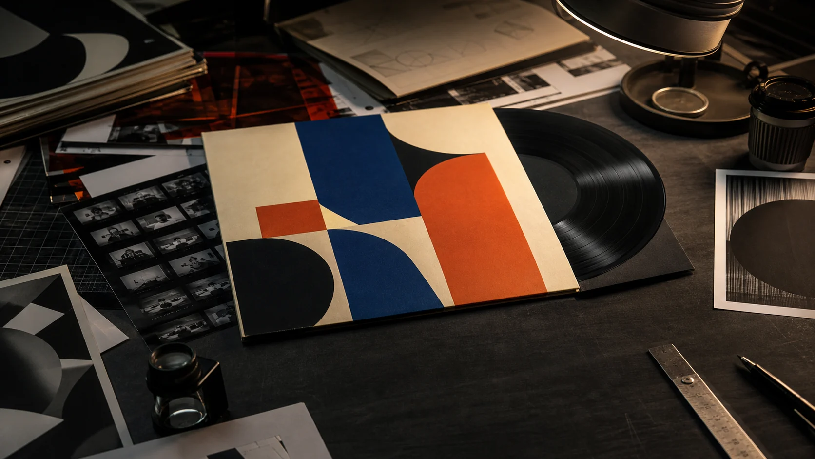
The image gets there first
A sleeve can suggest period, genre, distance, intimacy, or noise before playback begins. That expectation becomes part of the first encounter even when the music later resists it.
Design has rhythm
Scale, repetition, negative space, alignment, and interruption behave like visual timing. A tightly packed composition can feel urgent; a nearly empty field can make the same record appear quieter or more severe.
From object to thumbnail
Vinyl packaging once unfolded across front, back, inner sleeve, label, and insert. Streaming compresses that system into a small square, but the image still organizes memory and helps a listener find the music again.
Album cover art and music meet before playback
The record is still silent, but the encounter has begun. A face fills the sleeve, a title almost disappears, or an empty field of colour leaves the artist unusually small. Before the first note, the object has suggested a period, scale, temperature, genre, or attitude.
Album cover art and music do not create a fixed response. The image frames expectation. The listener may later hear confirmation, contradiction, or no useful connection at all. That uncertainty is what makes the first listen worth examining rather than reducing the cover to packaging.
The sleeve gives the ear a prediction
A dark close portrait can imply intimacy; a crowded collage can promise excess; restrained typography can suggest formality or control. These are learned visual cues, shaped by other records, advertising, fashion, film, and the listener’s own history. They are not properties embedded in the sound.
Productive criticism describes the cue before interpreting it. Name the crop, contrast, type size, material, and relation between image and title. Then ask what the first minute of music does to that expectation. The bass may arrive heavier than the spare cover suggests, or a violent image may frame music that opens almost without attack.
Typography and photography have different kinds of authority
Type can behave as information, image, or both. A small classical serif may place a release inside an established catalogue language. Hand lettering can imply immediacy or craft. A distorted wordmark may be more memorable as shape than readable as title. The article should identify the type’s role without inventing a designer’s intention.
Photography carries its own ambiguities. A portrait may sell recognisable identity, stage a character, hide the performer, or shift attention toward place. Record photographer, designer, art director, label, date, and edition when those credits survive. The person who pressed the shutter did not necessarily choose the crop, type, or final sequence.
Genre codes work because they can be broken
Repeated visual habits help listeners browse: certain letterforms, colours, poses, and compositions become associated with metal, jazz, dance music, folk, or orchestral releases. A code can orient quickly, but it can also narrow the imagined audience before anyone hears the work.
The most revealing cover may refuse the expected code. A severe monochrome sleeve can contain exuberant pop; a polished portrait can frame abrasive electronics. The mismatch sends the listener back to both objects. Is the sleeve hiding a sound, arguing with it, or showing that the genre label was too simple?
Twelve inches became a thumbnail
An LP sleeve can be held, turned, opened, and read in sequence. Gatefolds, inner sleeves, labels, paper, ink, and scale belong to the design. A compact disc compresses that field; a cassette changes its proportions; a streaming service may show only a small square beside playback controls.
At thumbnail size, fine type and peripheral detail disappear while one silhouette or colour relationship survives. Designers now work across physical and digital uses, but an article must name the edition actually examined. A streaming crop cannot silently stand in for a gatefold, and a deluxe reissue cannot be treated as the first release.
A first-listen experiment separates frame from sound
Choose unfamiliar music. First, study the cover without reading promotional copy and write three concrete predictions: dense or sparse texture, close or distant vocal, restrained or aggressive attack. Then listen to one track without looking at the image. Mark where the sound supports or resists each prediction.
Repeat later with the cover visible. The goal is not to prove that vision contaminates hearing; perception always arrives with context. The comparison shows which details came from the image, which came from sound, and which were created by their meeting. Another listener may make a different but equally testable account.
Memory edits the cover after the music becomes familiar
Return to a sleeve after years of listening and it may seem inevitable, as though the image always contained the music now attached to it. That feeling is partly retrospective. Repeated playback binds sound, title, image, place, and personal history until the first encounter becomes difficult to recover.
Reissues can exploit or disturb that bond. A new photograph, colour treatment, crop, or typeface may frame the same master as archival, luxurious, aggressive, or contemporary. Compare original and later editions without assuming one is authentic by age alone. Identify what changed, who changed it, and which audio version accompanied the new design.
Front cover, back cover, label, inner sleeve, booklet, and spine form a sequence. The front may create mystery while the back supplies personnel and place; the label may carry a separate visual system. Examine the order in which a listener handles those parts. A feature that reproduces only the famous front image can miss how the package delays information, changes scale, or turns credits into part of the design.
The object needs credits and rights
Museum records are valuable when they identify the exact artifact. MoMA’s LP Covers—Music in Your Hand discusses additions to its design collection and presents named works with creators, dates, dimensions, and images. Those fields make interpretation more accountable.
Online availability is not permission to reproduce a sleeve. Keep creator, source, licence or permission, edition, crop, and modification status together. Continue to Art for visual culture or return to the Blog index. The first listen changes because seeing and hearing build one encounter, not because the picture dictates the music.
Keep following the subject
These pages pick up the mechanism, measurement, or source trail behind this story.